Another artefact created for Phoenix Partnership was a coaster which they could handout to potential clients to keep the brand image and name in their minds if used. Coasters are often given out by other companies in the financial sector as a way of marketing themselves and so it was important for Phoenix Partnership to have a design that they can use. The design was made using Adobe PhotoShop. Due to the small size of the average drinks coaster, the information had to be limited to remain clear and the company logo and name had to be the biggest and clearest part to ensure that this piece of promotional material would work successfully. The square shape was chosen as opposed to a circular shape as it would allow for more information to be added, increasing the chances of someone using the contact information.
The Coaster Design for Phoenix Partnership
The background chosen was plain white with a blue border. This was to make the text and logo clear and the blue border helped to make it more aesthetically pleasing. The information chosen included a brief description of the company ‘FCA Regulated Independent Mortgage and Insurance Advice.’ This was chosen to be at the top as it’s important that people remember what the Phoenix Partnership company does. Underneath the description, the logo was added in a large size so that it was easy to recognise, even on the small size of the coaster. At the bottom of the coaster important contact information was added including address, phone number and email address in order for people to contact the company without having to search for contact information online. Additional information wasn’t chosen for the text size to not be reduced as it would have made it harder to read.
One of the things Phoenix Partnership wanted from Rogue Media was a new design for a letterhead and a new design for their business cards. This was since that they were receiving a new company logo and so they wanted their designs to change as well.
When creating the design, many examples were looked at online to ensure that it was like other companies which had been proven to be successful. The previous Phoenix Partnership letterhead design was also looked at to help provide the information that they wanted.
Example 1
Example 2
Example 3
When working on the letterhead, the client requested that this new design shouldn’t take up too much space on the page. It should also provide information relevant to the company so that their customers would be able to contact them. Most of the examples found had both headers and footers, however, it was requested that there wouldn’t be a footer in order to create more space on the page.
The deign created was simple and provided the logo with company name, phone number, address and email address. The design also didn’t take up a large proportion of the page and due to the simple design, it wouldn’t detract attention from the document’s contents.
The Final Letterhead Design
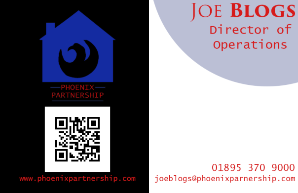
The business card was designed with the same ideas in mind, it head to be simple due to their small size and contact information had to be easy to read. The information on the business card included the company name/logo, the website, the email and the name of the person working for Phoenix Partnership. There is also a QR code which will lead to the company website. QR codes are being used more frequently as it allows people to get on the website with minimal effort.
Final Business Card Design
The only issue with Rogue Media creating these media artefacts is that they initially don’t posses the means to mass produce these products and so an outside company will have to be sourced to print these off. This will limit the amount of money that can be made from selling these, however, as Rogue Media are focusing on the design element, it would not be cost-effective to purchase large-scale printing equipment as this would not be an effective use of the company’s budget initially.
One artefact Phoenix Partnership were interested in was a website design. This was due to discussions about how important a website is at capturing a larger number of clients in today’s current age. A website allows the potential clients to have an area of reference for the company, adds credibility and as “60% of small businesses in the UK still have no online presence” it allows you to capture an audience via a means most small businesses don’t currently have.
The Phoenix Partnership Website Pages Created
The website design created was a mock up idea so that Phoenix Partnership could visualise how the website would look. For this design, three pages were created in Adobe PhotoShop to demonstrate how these will differ from each other whilst still staying consistent with each other. The website menu at the top featured the following pages:
‘Home’-This page is the main page where potential customers would view first. It features a simplistic design with a brief description of the company/what they do along with a copy of their promotional video to help sell what the company is about to the potential clients.
‘About Us’-This page features brief descriptions of what the company’s aims are that potential clients can see whether they are suitable for the service they require as well as provide a list of some of their selling points. These were listed with bullet point shaped like ticks. The use of ticks as bullet points was common with many websites in the same sector as they help keep up positivity about the company. At the bottom of this page was a box left empty so that client reviews could be added if they started to use their website and ask for customers to review their service, again this was common to see on other websites.
‘Services’-This page would show the range of services that Phoenix Partnership offers. This is an important page as it would give a more detailed look at what they do.
‘FAQ’-This page would be for Phoenix Partnership to answer any frequently asked questions. This would potentially help save time as potential clients may not have to contact to ask a question as it may have already been answered.
‘Contact’-This page was designed to have a variety of contact methods to allow the potential clients to make contact to request a service or for general enquiries.
To create the design, research was conducted into what makes a website successful and a few key points arose. The Guardian listed accessibility as one of their tips. Being accessible means allowing people to make contact in a way that suits them. Therefore, the contact page was added so that customers can make contact via the contact form at any given time. There was also a map on this page so people can know where to meet the Phoenix Partnership staff, also at the bottom of each page there is a phone number and email address so people can use these to contact if preferred.
The Guardian also said that the website should focus on “building relationships with customers and potential customers” to capture this aspect there was a section left empty where there is space for a list of reviews from past customers, encouraging clients to provide feedback as well as attracting new customers with high rated reviews.
The home page was designed around an example from the website for Santorini, a financial planning company. In this design, there was a large logo as well as a video on the homepage below. Also in the example shown, beside the video was a quote about the company’s aims and so this was replicated on the Phoenix Partnership website as it allows the potential clients to see the work that they can do quickly in text or via an easy to access way.
Santorini Website Home Page
Another website looked at was the one for Bankfield, the independent financial advisory company. This website featured a contact page which was clear to understand an access. This was used to help design the Phoenix Partnership contact page. The Bankfield example was uncluttered and featured, contact details, a map as well as an online contact form. This provided many ways for the client to contact and so this was adopted in my design.
The Bankfield Website’s Contact Page
The Hunter Aitkenhead & Walker website helped me to come up with the idea of having a review section on the Phoenix Partnership website. This website had reviews from past clients on their website. The reviews will help increase the company’s credibility by showing that people are happy with the service they receive.